5. Analyzing results#
Result analysis menu gives access to two tools, which are a simple visualization of individual paths recorded in the demand database under Path_links and a dynamic visualization for the data from the results table LinkMOE.


5.1. Visualizing individual paths#
In some instances, the user may want to plot paths recorded during simulations in order to better understand (debug) results. For that case, this tool allows the user to simply type the ID of the path of interest and select whether to select links from the link layer or to copy the links that are part of the path into a new layer.
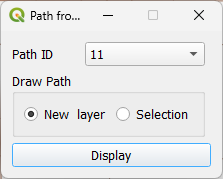
Using the tool is extremely simple.

5.2. Traffic assignment visualization#
After loading the result database the user can select the menu for mapping the link result, which will present them with the following screen.
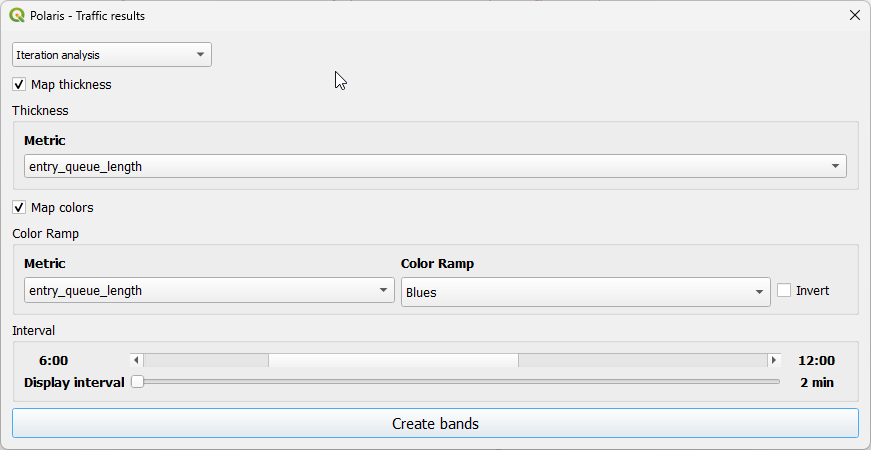
In this screen, the user can choose the initial time interval for which the map will be made, as well as the metrics to be mapped as a width range and as a color range in the map.
Note that that the user is NOT required to use both thickness and color ramp for any plot, although we have found that certain combinations like density and volume are particularly insightful.
When not setting up the color ramp as the secondary measure for depiction, the user can also set the desired color for the thickness map, which will look somewhat like the map below.

Note
The user should be aware that loading the a results database requires that QPolaris reads a large amount of data for caching, which is what allows for a smooth experience while navigating the data. This may take up to several minutes, so be patient!
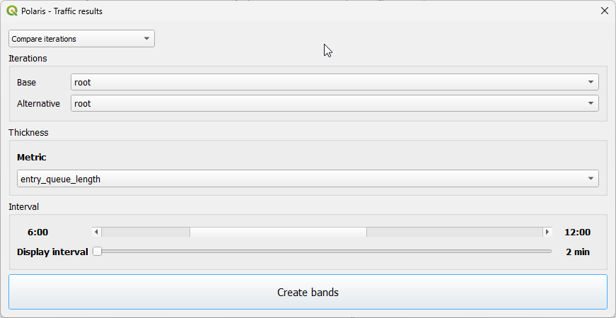
5.2.1. Scenario comparison#
Besides visualizing traffic results for the active iteration, the user can also compare any two iterations available in the model root folder. This can be achieved by selecting Compare iterations from the drop-down selector on the top of the tool window, which reveals two drop down menus with all the iterations to choose from, as shown below.
It is also possible to compare an iteration from the active model with those from an interation from a different model run. This can be achieved by selecting Compare across model runs from the drop-down selector on the top of the tool window, a bow from which the user can select the iteration from the active model to compare. The user will have to load the new model by clicking on the Open model button and navigating to the folder with the model to compare. Successfully selecting the new model’s folder will load all ts iterations in the second drop down box, from which the user can select the iteration to compare.
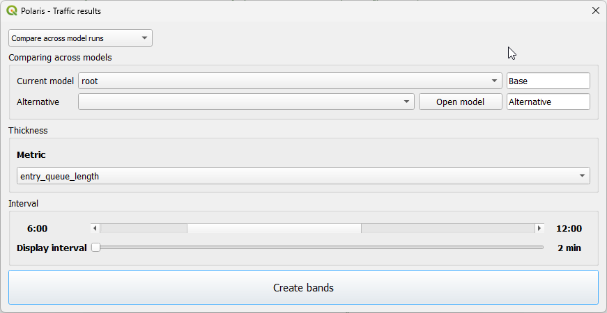
In both of these cases the user can only choose one metric, and colors are set by default.
5.2.2. Navigating results#
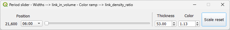
After clicking on Create Bands in the previous GUI, the map will be prepared and a the GUI below will appear, allowing the user to change the simulation period of analysis, as well as the scale for both color and thickness (scales are a multiplier of the thickness and intensity shown in the map, and can be set from 0.1 to 50.0).
Bear in mind that, while filtering the data is rather quick, rendering may take longer than ideal. If the map canvas includes only a few intersections, however, rendering should take only a fraction of a second, allowing for fine-grained analysis of results.
The results can be quite enlightening, though.

5.2.2.1. Comparison results#
The time slider behaves similarly when going through a scenario comparison, with the difference that the color intensity dropdown is replaced with a threshold one, where the user can pick which absolute differences actually matter for highlighting on the map.
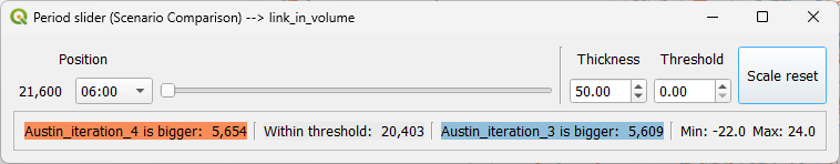
It is also important to highlight that there are statistics about the number of links in each class (base is larger, alternative is larger or within the threshold), as well as the minimum and maximum values for the difference for the interval being mapped, which are automatically updated as the user changes the controls in the interface.
5.3. KPI and KPI comparison charts#
QPolaris provides an interface to the Polaris-Studio KPI comparator class, allowing for seamless visualization of all KPI comparison charts available in that class. Access to the interface is possible through the menu Result Analysis -> plot KPIs

The actual interface to the KPI plotting tool is extremely simple, and allows users to select one chart at a time with any arbitrary number of iterations. As shown in the animation below, charts change dynamically as the user adds or removes model iterations to the chart or changes the chart selection, so no buttons or drop down menus are required.
Note
KPIs that have not yet been computed and cached can take many seconds to load for the first time
5.4. Creating Desire Lines and Delaunay Lines#
An useful way to to visualize transportation demand is in the form of Desire Lines, or the more modern Delaunay Lines, which are both natively available in Polaris-Studio.
Note
Producing these outputs can be time-consuming (up to 60s or more), depending to the size of the model and
computer being used.
Creating these visualizations is also possible in QQIS through QPolaris’ processing provider, through the tool  under Result Analysis.

The GUI allows for the creation of Desire and Delaunay Lines, either at County-level or Zone-level aggregation.

The procedure creates temporary spatial layers with flows for all modes available in the Trips table, and the user can choose any of these modes (or total) for the flow map that is automatically created. If the chosen mode does not exist in the source data, total is used instead.
Regardless of the mode chosen, however, all modes (and total) are added available in the output for the time period chosen when executing the procedure.
